Practical guide
Choosing colour for a small rendered frontage
On a small terraced front, the render is only part of what you see. Windows, the door, the sill and lintel, the roof and the brick of the houses either side all sit in the same view. A colour that looks right on a card can look stark or muddy once it is on the wall among them, so the choice is best made on the wall itself.

On this page
Start with what stays
List the things that will not change: the window frames and door, any stone sills or lintels, the roof, and the houses next door. On a Victorian terrace these can be strong colours. Hull City Council's appraisal for Ella Street describes red fletton brick with lighter brick string courses, and its Hessle Road leaflet describes red and gault brick façades. A render colour has to sit comfortably beside those, not compete with them. Look at the roof as well: blue-grey slate and red clay tiles pull the same render colour in quite different directions, and so do white and dark window frames.
In a row of brick houses, a rendered front already stands out. A soft, warm tone usually sits more quietly than bright white or a saturated colour, but that is a matter of taste and context rather than a rule.


Colour and texture together
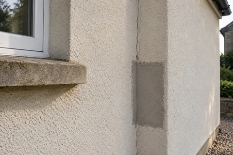
The same colour reads differently on different textures. A smooth or fine finish shows the colour flat and even. A scraped or rough finish breaks it up with tiny shadows, so it can look slightly darker and softer. A pebbledash coated in a new colour keeps its stony relief.
If silicone rendering is on the shortlist, compare its fine grain with a scraped monocouche at the same colour. SAS offers its Colourtex in a 1.5mm Uniform grain that it compares to painted sand and cement, and a 3mm Grained texture with a more rustic look, and says it can tint to RAL, NCS or BS colours or match a sample.
Samples on the wall
Colour cards and screens are only a guide. Ask for a sample in the actual product and texture, as large as practical, placed on the front wall rather than held up indoors. Look at it in the morning, at midday and in the evening, and on an overcast day. Stand across the street as well as at the door, because a frontage is mostly seen from a distance.
For a colour change on existing render, a test area of the coating on the wall shows how it looks over the existing texture. For a new through-coloured render, Parex advises using the same batch number across a façade to reduce colour differences, which is worth remembering if the sample comes from a different delivery.
Paint or colour in the render?
There are two ways to get a coloured front. One is a painted finish over render, which can be any colour and is easy to change, but has to be recoated as it fades. The other is a render coloured all the way through, a monocouche or a silicone thin coat, where the colour is in the material and there is no paint layer to peel.
Through-colour is not permanent colour, though. SAS advises overcoating its Colourtex silicone finish periodically, at least every 12 years depending on site conditions, and faded monocouche is usually brought back with a coating made for render; K Rend sells its Colour Enhance for scraped and unscraped finishes. Whichever route you choose, the colour will need attention at some point, so pick one you are happy to keep.
Light, shade and bays
A small front often has a bay or a recessed doorway, and their side faces spend much of the day in shade. The same render will look darker there. That is normal and part of the house's shape. Judge the sample on the main face and on a shaded face before deciding.
North-facing and shaded fronts can also go green more quickly. A colour that disguises a little dirt may age better than pure white in that position, whatever the finish.
Dark colours
Dark render colours are possible but need more care. Parex's data sheet for Monorex GM sets a minimum application temperature of 8°C for dark colours, against 5°C for light ones, so dark finishes have a shorter working season. Manufacturers also have views on very dark shades: JUB's installation overview, for example, tells installers to check dark colours with JUB for suitability. Ask whether the chosen colour is suitable for the product and the wall before ordering.
Details and controls
Small details make a big difference on a narrow front: a contrasting plinth band at the base, painted sills, a house number. Decide which parts are rendered and which are not, and how the render meets the brick of the houses next door, usually with a stop bead at the party line.
Check the rules before committing. Painting is usually permitted development, but Hull City Council uses Article 4 directions to control particular alterations in certain areas, and rendering a brick front in a conservation area counts as cladding that needs a planning application. The council can confirm what applies at the address.
A worked example
Imagine a hypothetical two-bedroom terrace with a narrow rendered front between two red brick neighbours, white uPVC windows, a dark blue door and a stone sill to the bay. The owner shortlists three colours from a card, a pale grey, a warm off-white and a light sand. Large samples on the wall show the grey turning cold beside the brick on an overcast day and the off-white glaring in sun, while the sand sits comfortably with both the brick and the stone. A slightly darker plinth band at the base hides splash marks. The colours and outcome are illustrative only.
After the work
Keep the colour reference, product name and, for through-coloured renders, the batch number. A small repair or a touch-up later will need them, though a patch on a weathered wall may still look fresher than its surroundings for a while. Wash off green growth before it takes hold and keep gutters clear so the new colour is not streaked. For other work on your walls, see the Hull rendering homepage.
See housing and planning information for Hull and nearby places, including the source and geography behind each figure.